Artwork
Client:
M&S, Greggs
Brief:
Tackle and resolve the intricate printing and artworking challenges that arise during large-scale printing operations for high-profile B2B clients.
–
Solution:
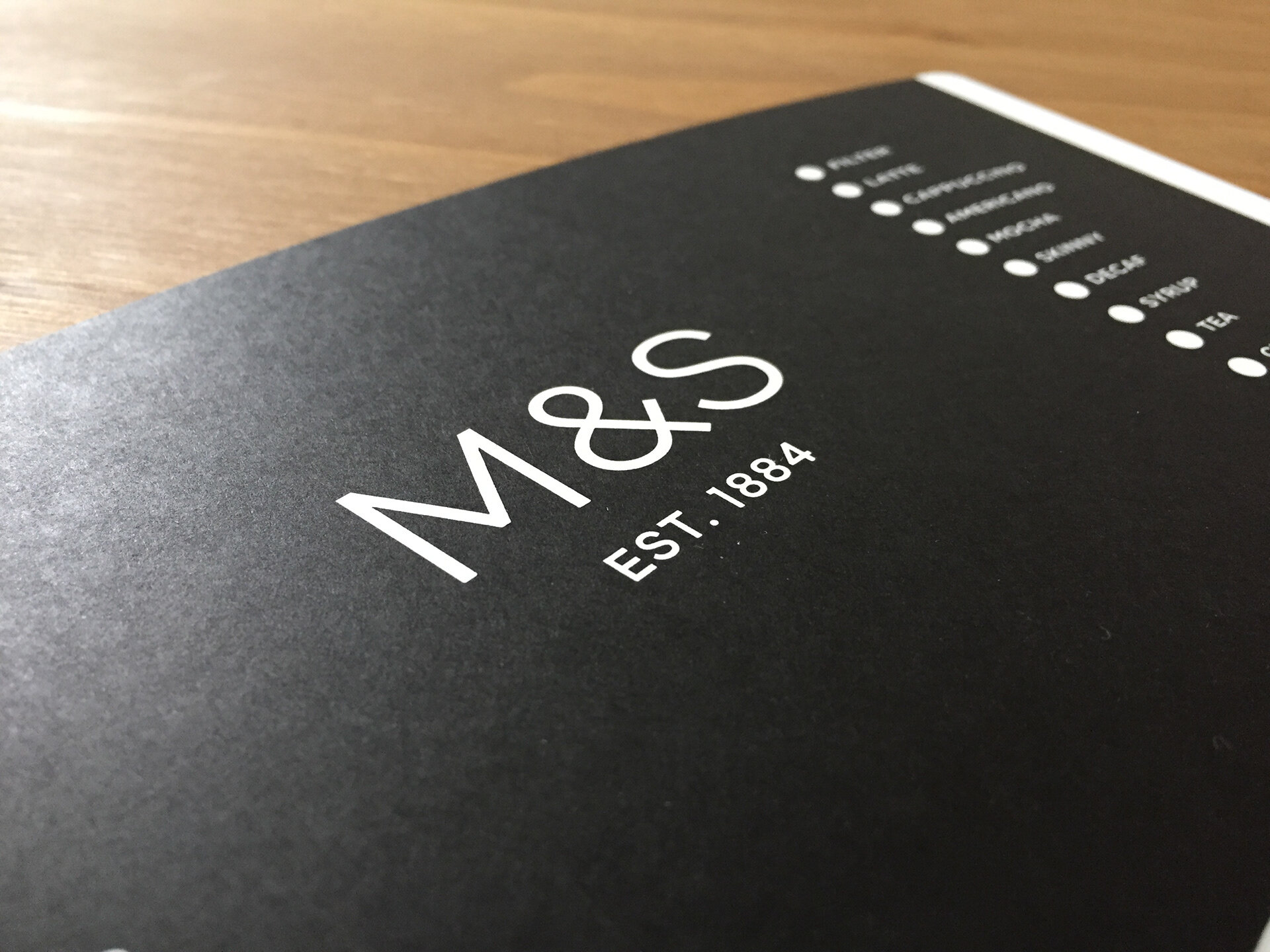
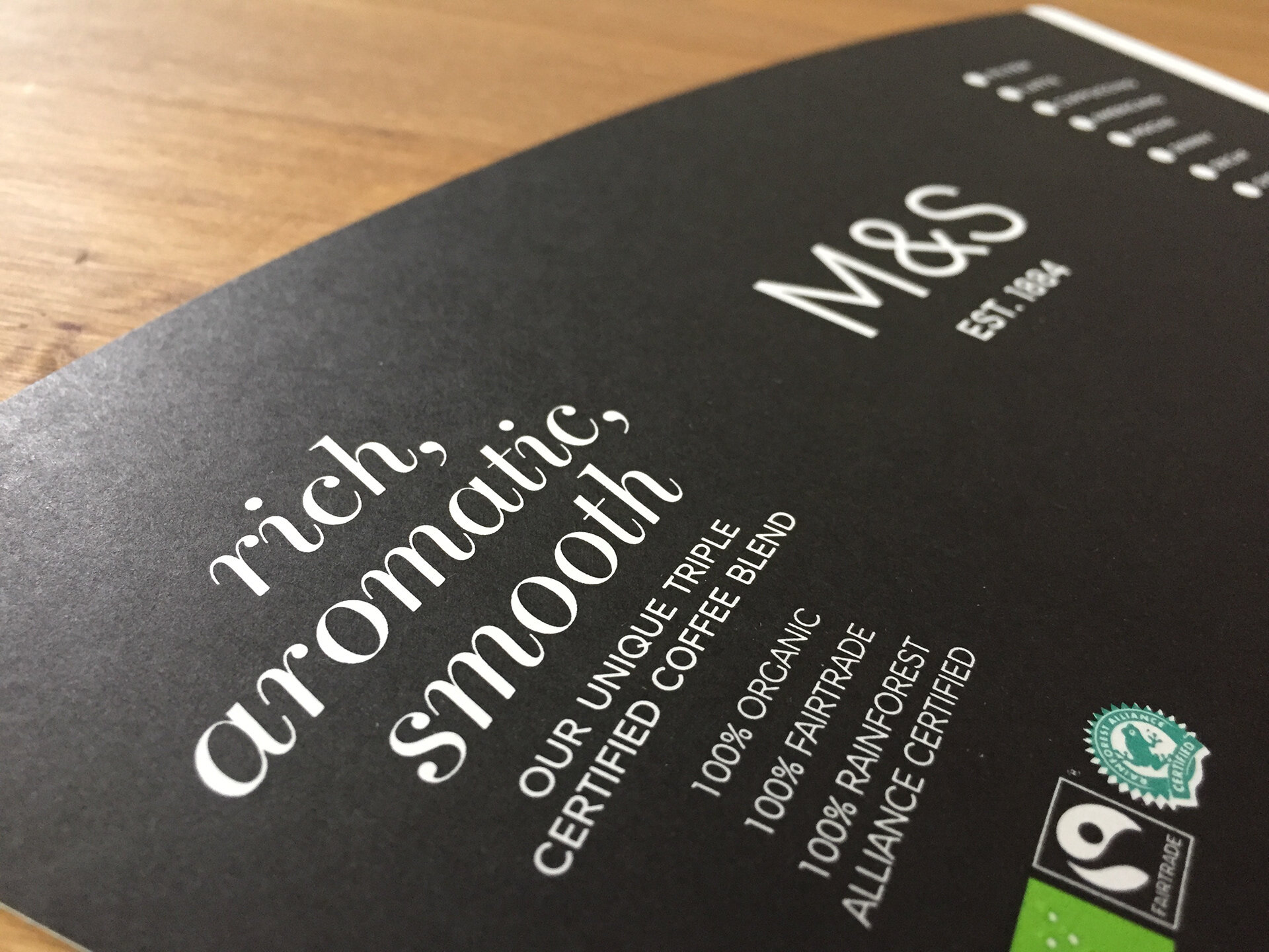
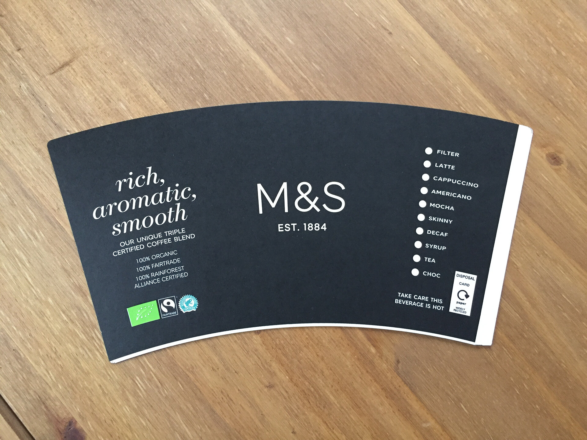
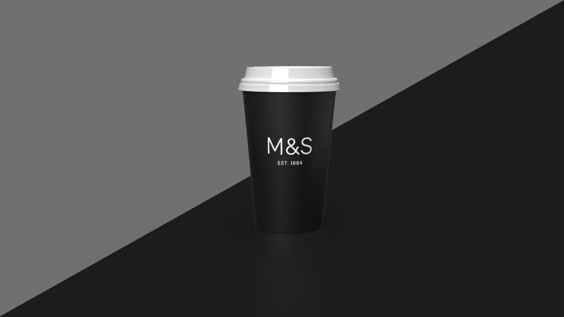
M&S
The initial design for M&S's cup was meticulously crafted with a 7-degree bend, intended to enable the design to gracefully envelop the cup's surface. This innovative approach, however, had an unintended consequence: the ampersand within the M&S logo became visibly distorted and lost its original integrity. Recognizing this, our team took proactive measures to restore the symbol to its pristine form. The intervention, although appearing subtle, was pivotal. It ensured that the brand's image was upheld and that the printed cups resonated with the quality and precision M&S is known for.
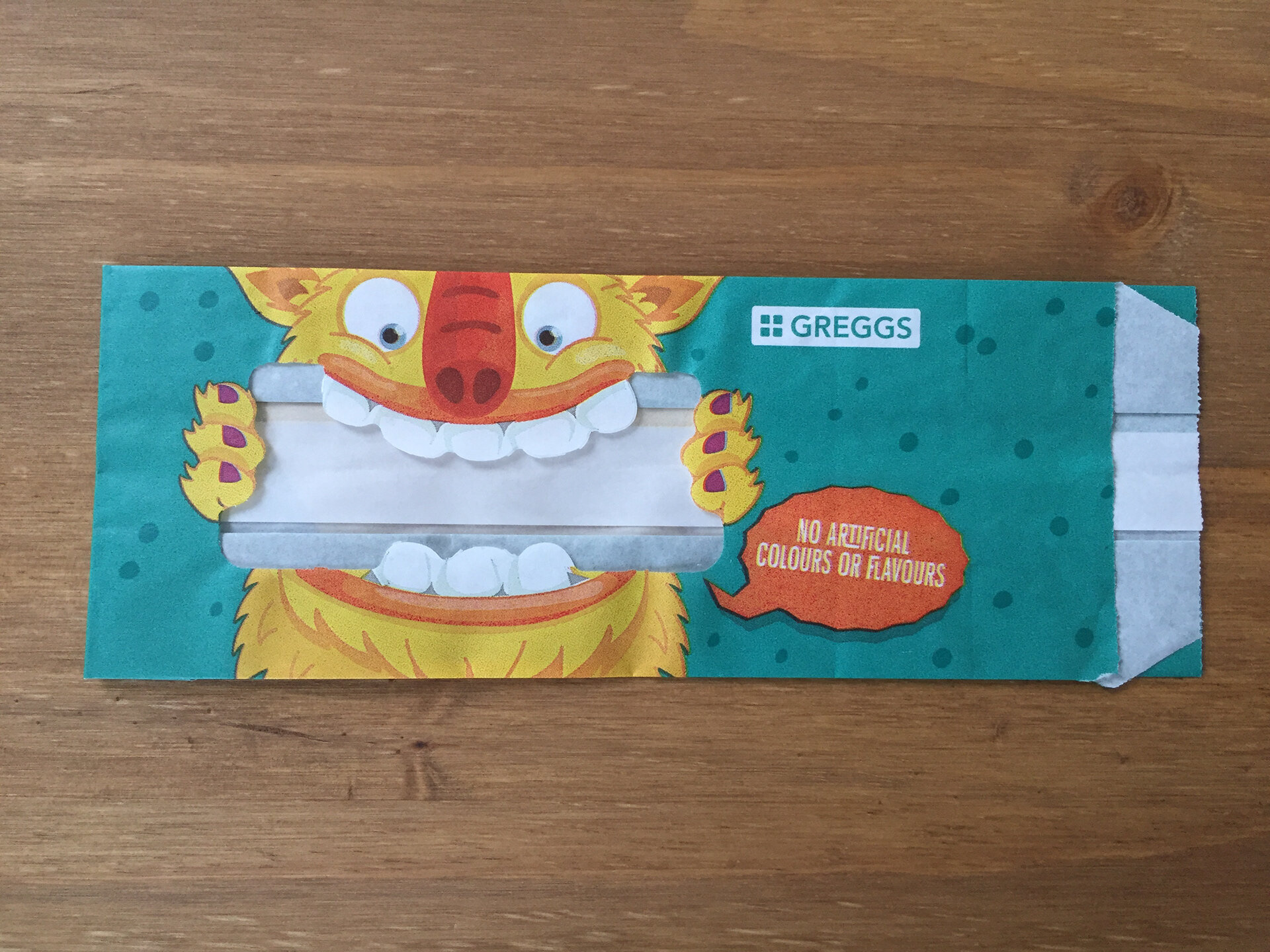
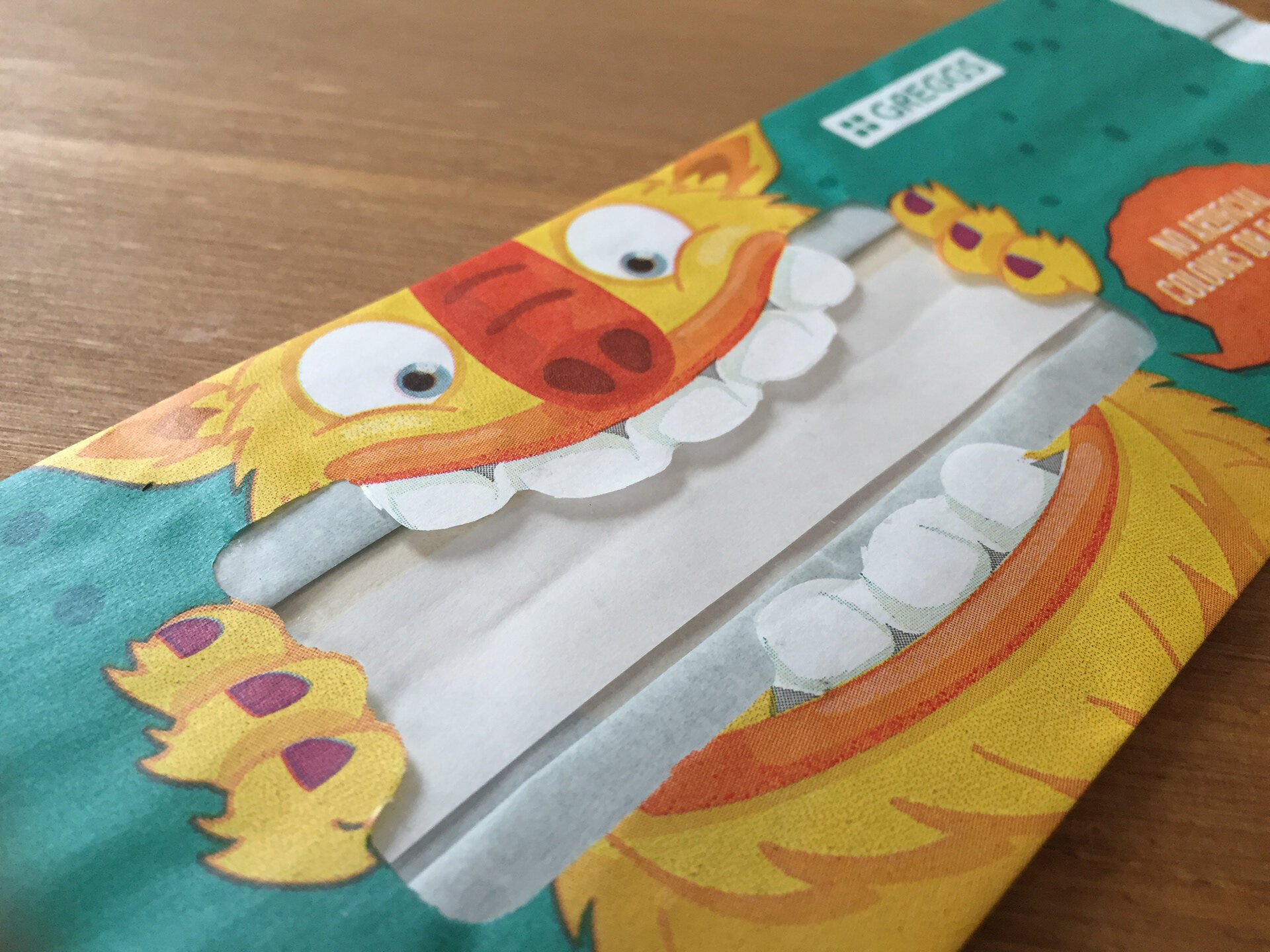
Greggs
Greggs presented a unique challenge, rooted in the nuances of mass printing. The inherent movement of the printing machinery can introduce minor misalignments, particularly noticeable in intricate designs. One such element in Greggs' design was the monster teeth character, which, when printed, risked highlighting any machine-induced misalignments. To preemptively counter this, our team revised the design, subtly adjusting the teeth to camouflage potential discrepancies. This foresight ensured the final print was both consistent and in line with Greggs' brand standards, even in the face of mass production's complexities.